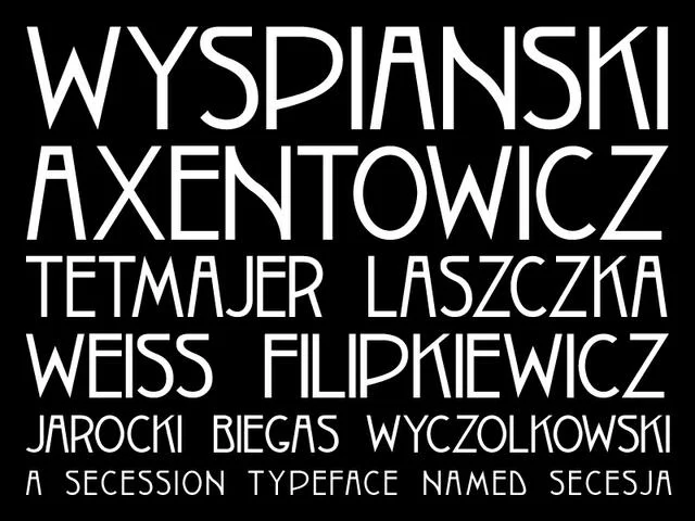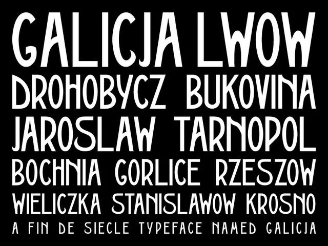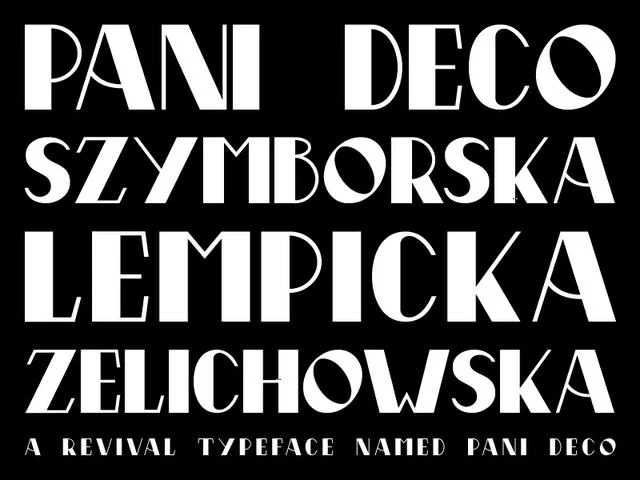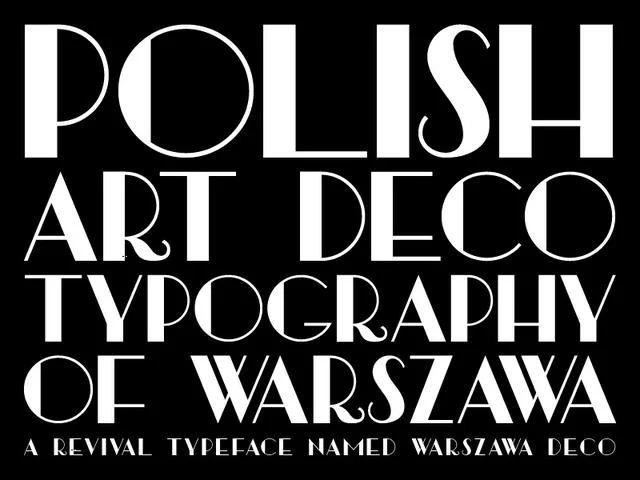
Between the last years of the partitioned Poland and the outbreak of the Second World War, Polish designers produced one of the most distinctive bodies of graphic and typographic work in twentieth-century Europe. This guide traces that arc — from the Young Poland movement of 1908 to the Warsaw Art Deco of 1939 — and the historic specimens that inspired the Warszawa, Galicja, Pani Deco, and Secesja typefaces.
1. Młoda Polska — Young Poland (c. 1890–1918)
"Młoda Polska" — Young Poland — was the Polish response to the wider European Secession and Art Nouveau moment. Centered in Kraków, then part of the more permissive Austrian partition of Galicia, it drew on folk motifs from the Tatra highlands, Symbolist painting, and the flowing organic forms of Vienna and Munich.
For typography, this meant hand-drawn display lettering full of curled terminals, teardrop counters, and vine-like ligatures. Posters printed by shops such as Piller-Neumann in Lwów (present-day Lviv) treated headlines as ornament, closer to jewelry than to text. The 1911 Piller-Neumann poster that inspired Galicja is a canonical example: elongated letterforms with softly bulging strokes, set inside a decorative frame that itself borrows from Secessionist ironwork.
The 1908 Kraków poster behind Secesja shows the movement at its most decorative — the letters compressed into a rhythmic pattern, closer to woven textile than to a traditional alphabet.
2. The Kraków Workshops and the search for a Polish letter
After Poland regained independence in 1918, the search for a national visual identity became urgent. The Warsztaty Krakowskie (Kraków Workshops, founded 1913) brought painters, architects, and printers together around folk-modern design — an attempt to fuse the Young Poland heritage with a modern, industrial vocabulary.
The most consequential typographic result of this project was Antykwa Półtawskiego, designed by Adam Półtawski and released in 1931 — the first mass-produced Polish text face designed specifically to accommodate Polish diacritics and rhythm. It became the standard for interwar Polish books and set the tone for how Polish text was expected to look on the page.
3. Interwar Art Deco — the Second Polish Republic (1918–1939)
The Second Polish Republic embraced Art Deco with unusual intensity. Warsaw, Katowice, and Gdynia were rebuilt with Deco cinemas, stations, and apartment blocks; posters for state railways, ocean liners, and industrial fairs used strong geometric letterforms to project modernity.
Polish Deco lettering has a few recognizable habits:
- High-contrast geometric constructions, often with dramatically thin horizontals.
- Circular O's and Q's paired with rigidly vertical stems.
- Diacritic marks integrated into the letterform, not tacked on afterward.
- An affection for very tight or very open tracking — rarely anything in between.
The 1928 poster by Anna Harland-Zajączkowska, source for Pani Deco, is a textbook case: high-waisted capitals with fine hairlines and a distinctly feminine confidence. The 1939 Warsaw document behind Warszawa Deco is drier and more official — the last gasp of civic Deco just months before the invasion.
4. Neighboring currents: Vienna Secession & Central Europe
Polish designers did not work in isolation. Galicia's Austrian ties meant constant traffic with Vienna, where Gustav Klimt, Koloman Moser, and the wider Secession had already codified a geometric-decorative vocabulary. Cross the border and you find the same idea worked in a slightly different accent — the source material for the Klimt and Seebad Grado faces.
Further south, Moravian and Bohemian artists such as Antonín Frolka and Polish Galician heraldist Rudolf Mękicki extended the same interwar Central European sensibility into painting, book design, and coats-of-arms — a reminder that the "Polish Art Deco" letter is really a regional dialect of a broader Central European style.
5. Where to see the originals today
- National Museum in Kraków — extensive Young Poland posters and Warsztaty Krakowskie holdings.
- National Museum in Warsaw (digital collection) — interwar posters and printed ephemera.
- Polona — the National Library of Poland's open digital archive; searchable for period books, brochures, and specimens.
- Typoteka — a Polish-language reference on historical Polish typefaces including Antykwa Półtawskiego.
6. Working with the letterforms today
Each face in the Letters of Central Europe collection is a direct redraw of a specific historical source rather than a generalized "Deco" pastiche. That constraint keeps quirks — a stubby G, an over-tall S, a peculiarly Polish Ł — that a purely modern revival would smooth away. Used in the right context (editorial, museum, hospitality, packaging that wants to signal old-Europe craft), they read as period documents rather than as pastiche.